

Warning: The following article contains spoilers for "Godzilla -0.0."
Warning: The following article contains spoilers for "Godzilla -0.0."
Warning: The following article contains spoilers for "Godzilla -0.0."
.
.
.
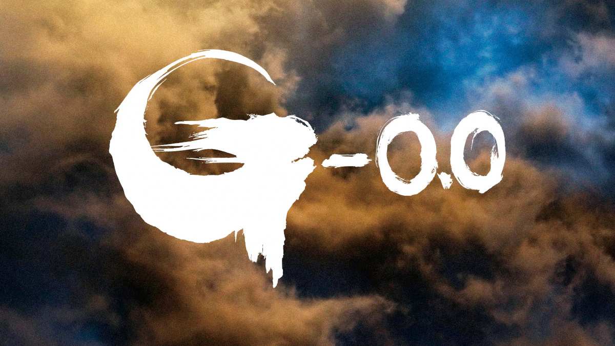
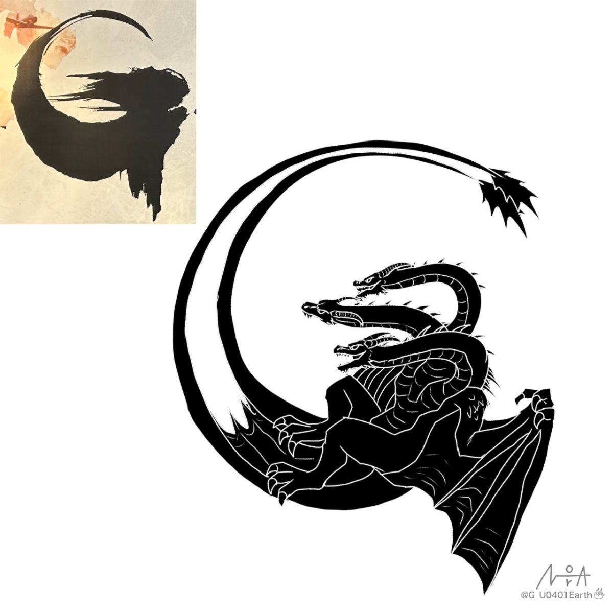
The logo for "Godzilla -0.0" (ゴジラ-0.0) has sparked plenty of discussion on Japanese social media. One fan noticed that its letter "G" may hide the silhouette of the classic monster King Ghidorah, then illustrated the idea to reconstruct the logo's design concept. The theory caught the attention of director Takashi Yamazaki himself, who confirmed that the fan had nailed it.
Japanese X user 猫怪獣ノラ (@G_U0401Earth) shared the illustration on November 8, 2026. Recalling Yamazaki's comments about the "G" logo at Godzilla Fest 2026, the user noted that the director had described the concept as having "three heads, wings, and tails that shoot outward." The fan then drew King Ghidorah's three heads, wings, and long upward-curling tails into the shape of a "G," placing the illustration alongside the film's official logo for comparison.
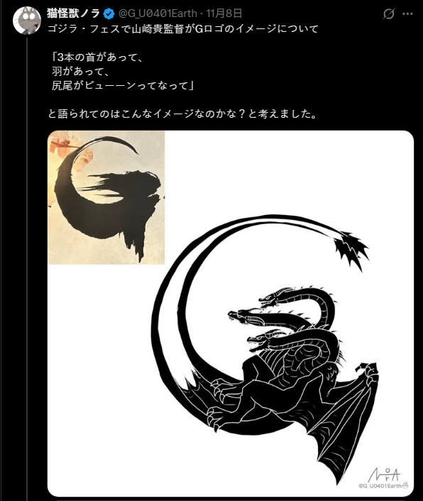
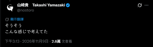
Yamazaki soon replied directly beneath the post: "Yes, yes—that's exactly what I had in mind." His response confirmed that the fan's interpretation matched the original design concept. Surprised and grateful to hear from the director himself, the user said they never expected Yamazaki to notice their work and once again praised the designs of Godzilla and King Ghidorah in "Godzilla -0.0."
According to Hobby JAPAN Web, Yamazaki discussed the thinking behind the "G" logo during a talk segment at Godzilla Fest 2026, along with behind-the-scenes details about the film's IMAX cinematography and visual effects. The outlet did not publish his full description of the logo, but this exchange on X offers the clearest confirmation yet of the concept.
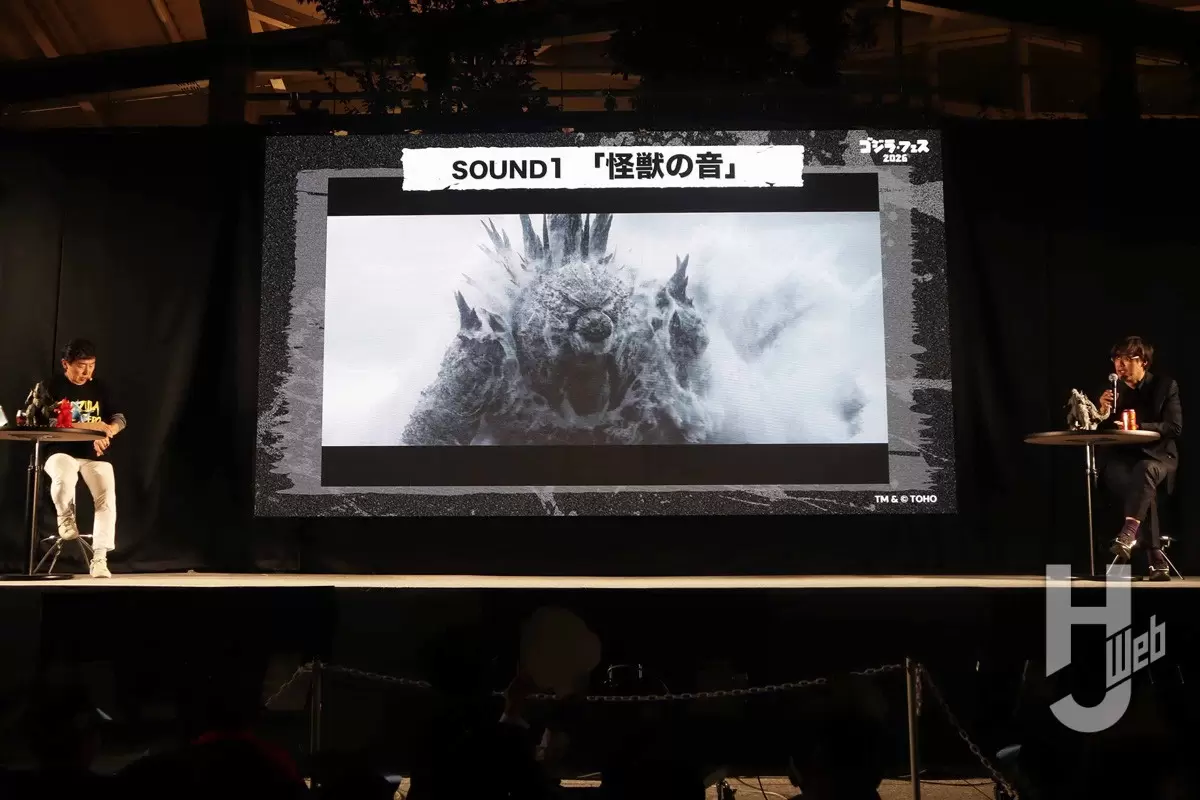
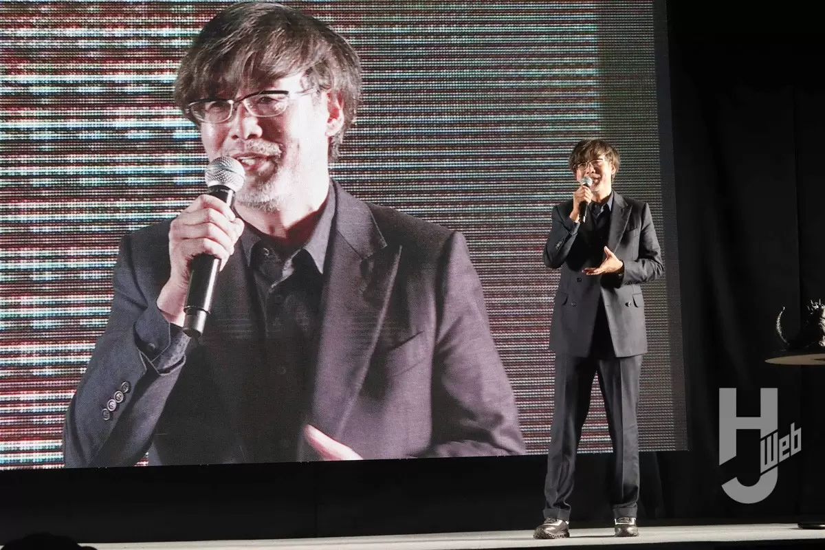
The title and logo for "Godzilla -0.0" were first officially unveiled at Godzilla Fest 2025 on November 3, 2025. According to Nikkan Sports, Yamazaki—who serves as the film's director, screenwriter, and visual effects supervisor—also personally designed its rough, brushstroke-style title logo. At the time, however, Toho had not revealed any plot details or explained the meaning behind the design.
Yamazaki also recently discussed King Ghidorah's design in an interview with Japan's SCREEN ONLINE. He said he wanted the iconic monster to have a sacred, phoenix-like presence, so he lengthened its two tails and added a membrane between them. Those details closely match the fan's "G" illustration, bringing the King Ghidorah imagery hidden within the film's logo into even sharper focus.