

Expo 2025 Osaka is set to kick off a six-month run in Japan starting in April, and while the government sees it as a major international event, public enthusiasm has been lukewarm, partly due to ballooning costs. Adding to the mixed feelings is the official mascot, Myaku-Myaku. Since its debut in 2022, it has been a polarizing figure—some see it as an international embarrassment to Japan's famed soft power, while others find the design refreshingly fun.
Recently, a user on X (formerly Twitter) in Japan wondered how this design managed to win the top spot, sparking a viral discussion after a professional game designer weighed in with a detailed analysis.
▼ The five finalists for the Expo logo
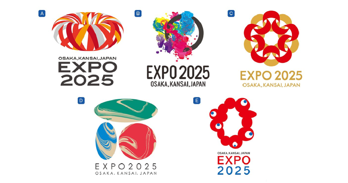
The original poster questioned how "Myaku-Myaku" could have possibly been selected from this lineup, unable to imagine how the other four designs were considered worse and even suspecting some kind of backroom deal.
(Yes, even with the Expo about to open in 2025, some people in Japan are still this baffled, showing just how skeptical a segment of the population remains.)
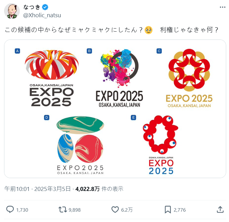
As the topic gained traction, a game design and illustration professional, yusamatsu【芸夢】, retweeted the post, noting they had discussed this exact topic with fellow designers and illustrators before.
From a professional designer's perspective, "aside from option E, 'Myaku-Myaku,' none of the others ever had a chance of being selected."
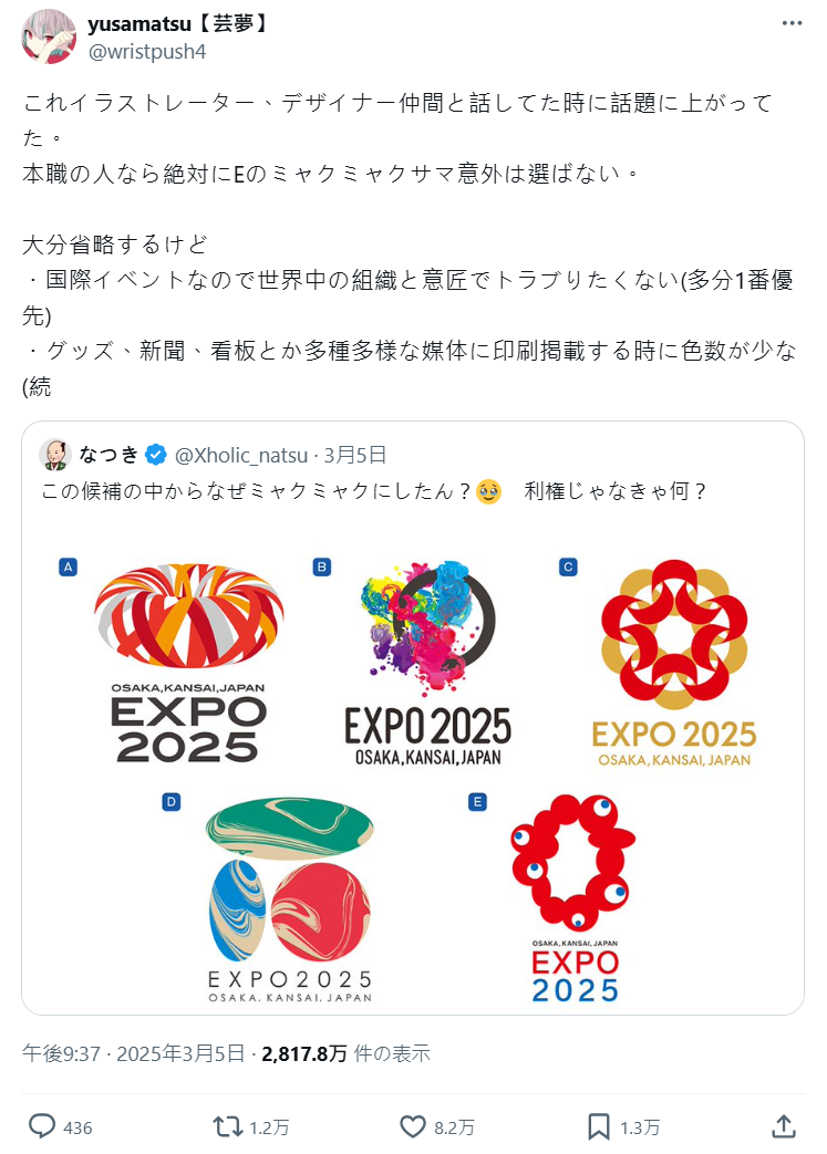
yusamatsu【芸夢】 broke down the key reasons:
For an international event, avoiding design and copyright disputes with global organizations is the top priority.
The design must be adaptable to all media, easily recognizable, and resistant to distortion. It has to be printed on merchandise, newspapers, billboards, and more. A simple color palette and clear form ensure it remains legible whether it's in black and white or shrunk down to the size of a keychain, unaffected by compression or print quality.
In design and illustration, "appeal" is secondary to meeting professional standards. This is the biggest difference between amateurs and pros. These requirements are also why AI-generated images aren't ready for commercial use. Insiders can use AI as a tool, but relying entirely on its output is a no-go.
"Back when I worked at a game company (though I never led a full creative project), the requests from planners were all over the place, and then the art director would tear my designs apart. Those experiences really hammered home how strict professional design standards are..."
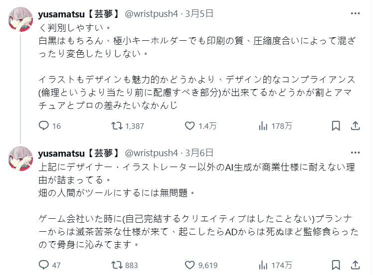
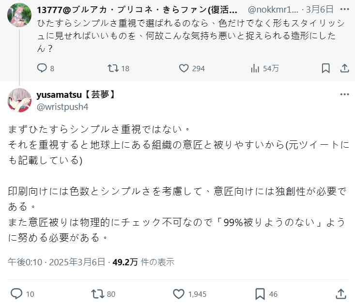
In a follow-up, they addressed a common question: "So, are you saying the other designs were just low-quality?" Not at all, they clarified. It’s more likely the other proposals just weren't fit for this specific purpose.
Design is always a trade-off between "cost and expressive power." The selection committee probably had different priorities than the other designers. In a more artistically-driven cultural context, one of the other options might have been chosen.
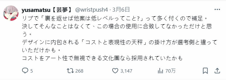
However, the original poster seemed unconvinced, firing back, "Are all you illustrators and designers insane? This is an insult to people who create characters seriously."
yusamatsu【芸夢】 offered a simple rebuttal: "The people who design characters seriously *are* illustrators and designers. Your logic has a bit of a flaw there..."
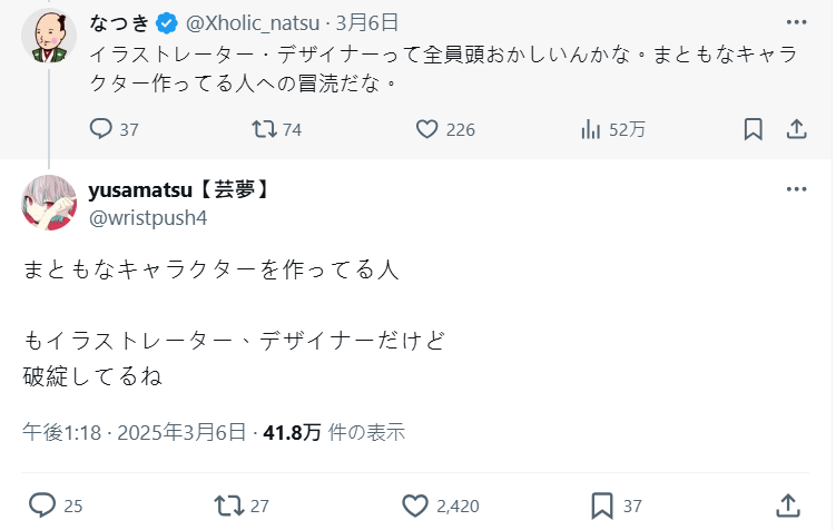
But if the goal was versatility for printing, another user asked, why not choose a shape and color scheme that was both simple and stylish, instead of something widely considered creepy?
yusamatsu【芸夢】 explained that design isn't just about "simplicity." Over-emphasizing simplicity increases the risk of accidentally resembling another organization's logo somewhere in the world. While color count and clarity are important for printing, originality is the real key. Logo similarity can't be checked by purely physical means, so you have to create something that is "99% collision-proof."
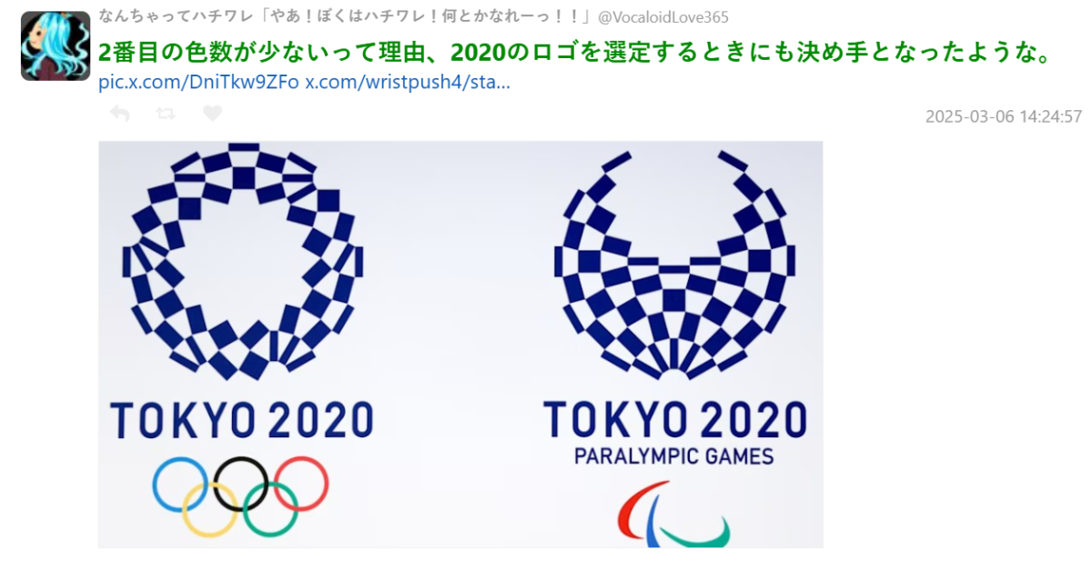
Speaking of "collisions," the original Tokyo Olympics Logo was famously withdrawn after its designer was accused of plagiarism, proving that creating a design for a major international event is far from easy.
▼ The original Tokyo Olympics logo, which was later pulled due to plagiarism allegations.

▼ The replacement logo for the Tokyo Olympics was also minimalist, with an even more reduced color scheme.
Supporters of "Myaku-Myaku" argue that the moment you see the logo, you can immediately imagine countless merchandise possibilities, from plushies to keychains. Compared to the other four candidates, "Myaku-Myaku" simply leaves a stronger, more lasting impression—and that's what a great mascot is all about.
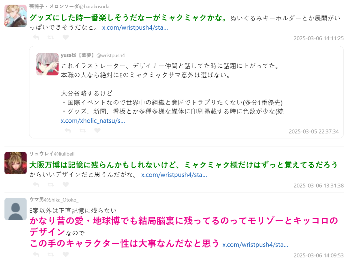
Of course, aesthetics are subjective, but this breakdown from a design professional offers a compelling look into the practical reasons why "Myaku-Myaku" ultimately came out on top.
via: togetter