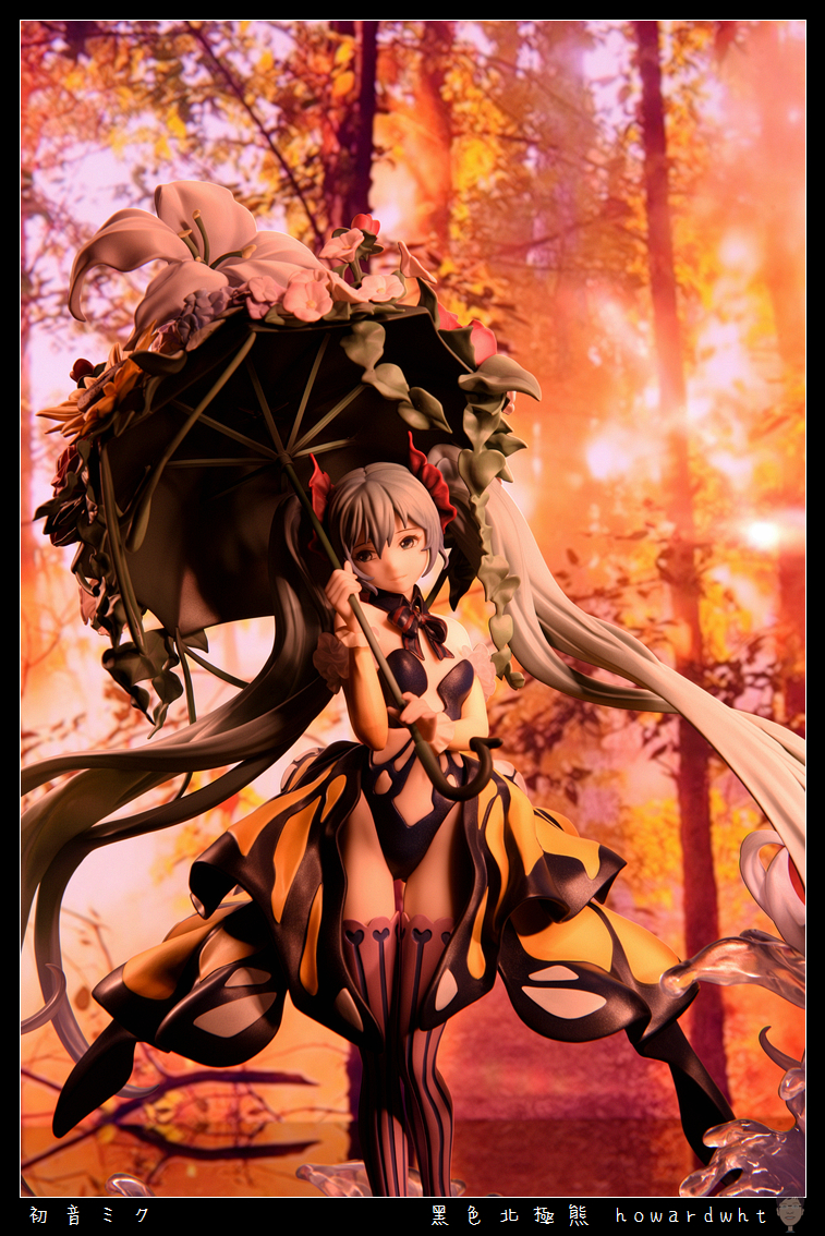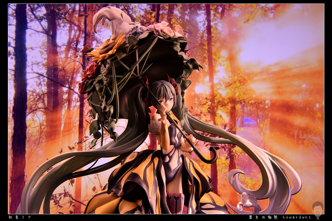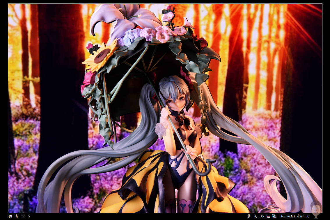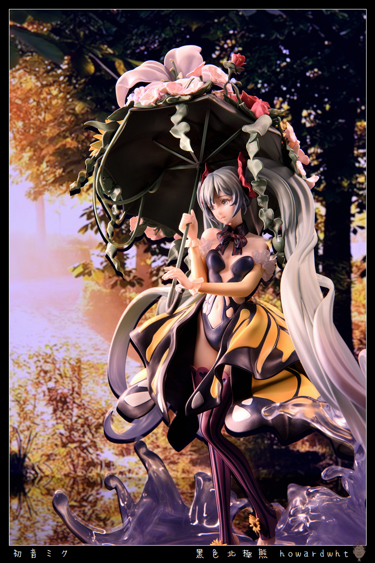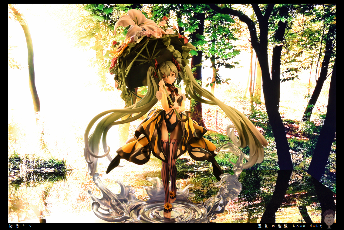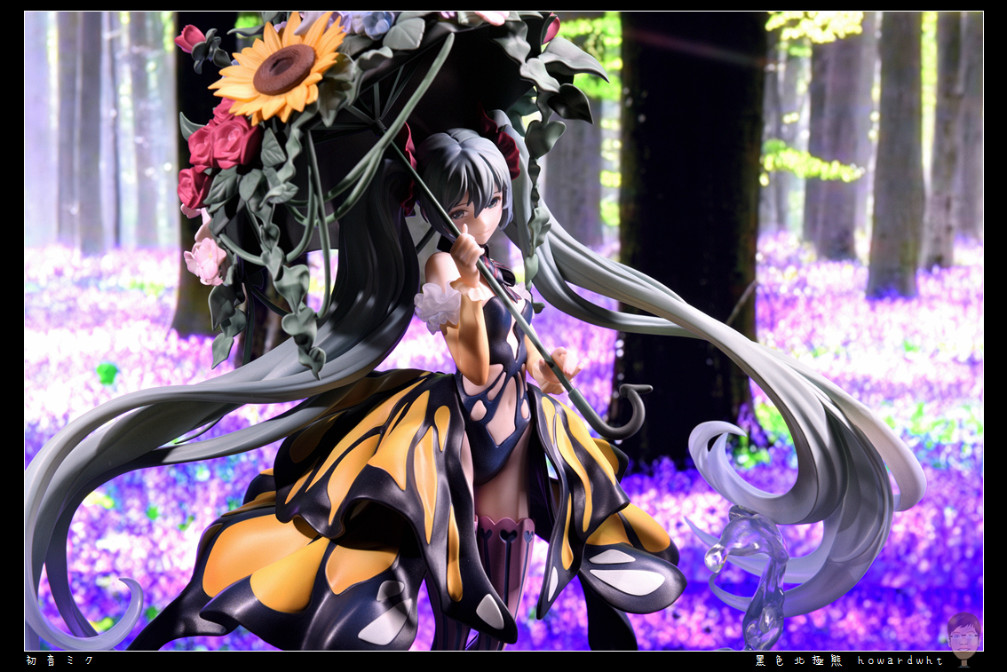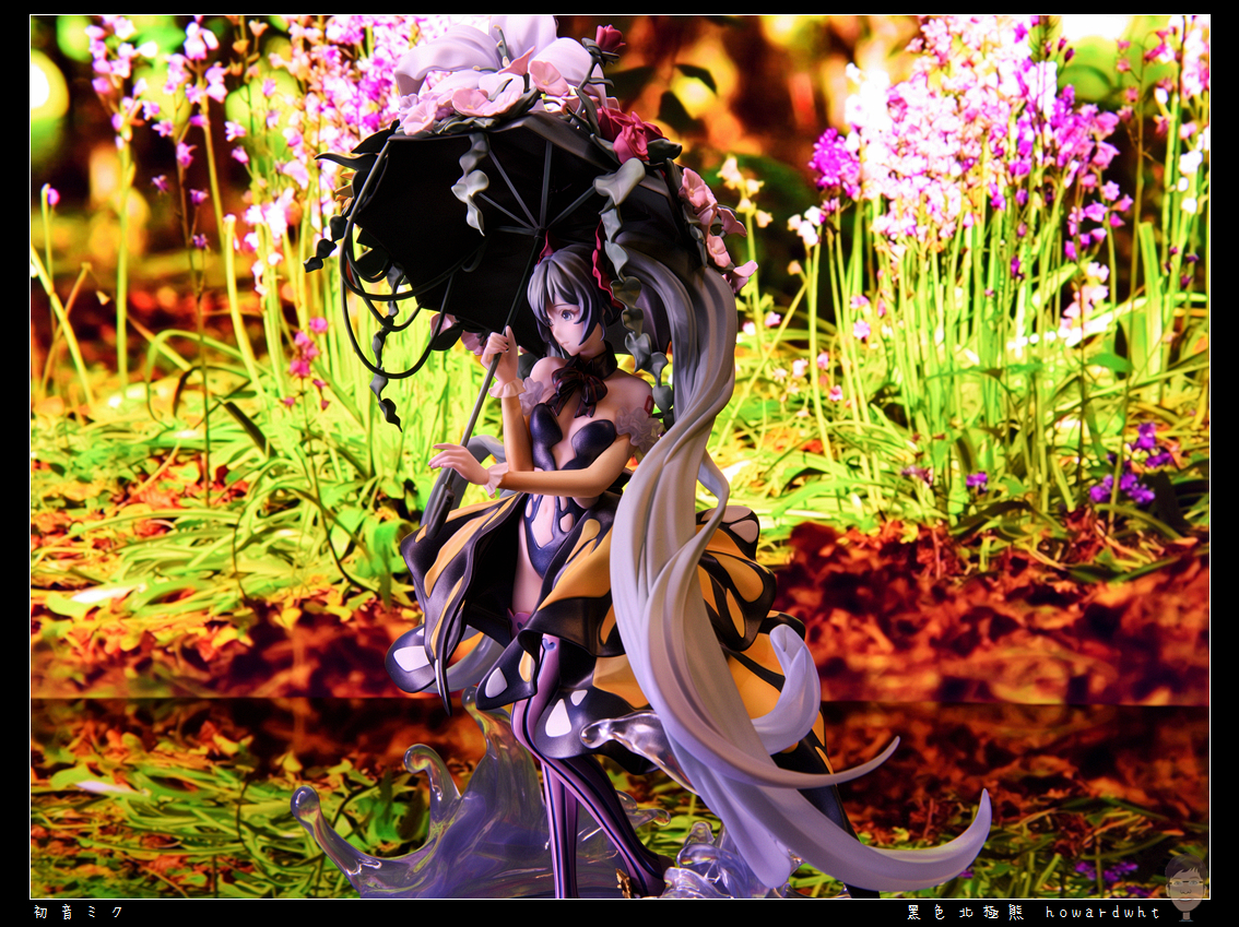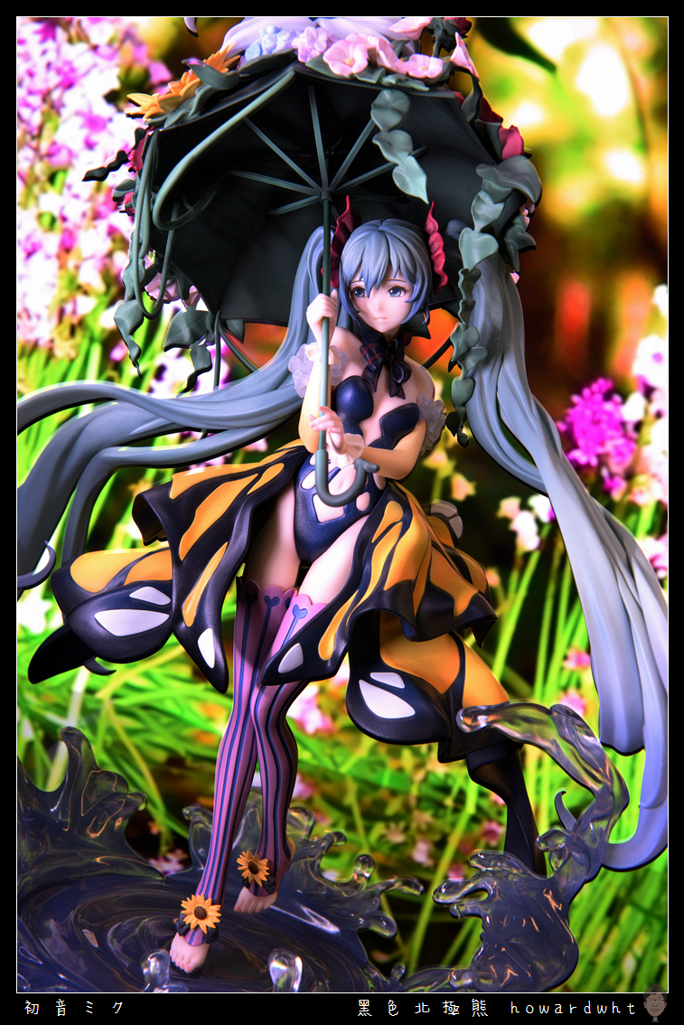
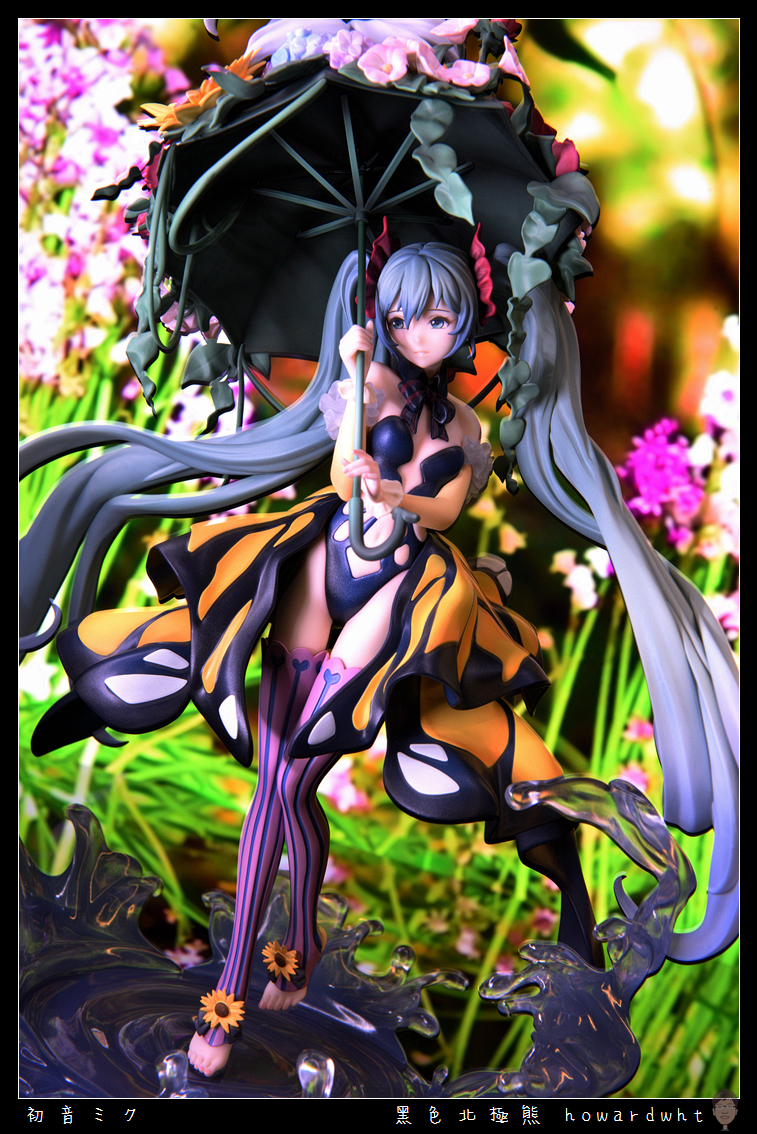
Hello everyone, today I'll be unboxing and sharing the Hatsune Miku Papilio Ver. by Bebox x CHE.
I couldn't find much detailed information regarding the origins of this particular design, so I won't be able to elaborate extensively.
My initial reason for pre-ordering was simply because I found the overall design to be very appealing and quite unique.
To my recollection, previous Hatsune Miku scale figures haven't featured a similar style or aesthetic.
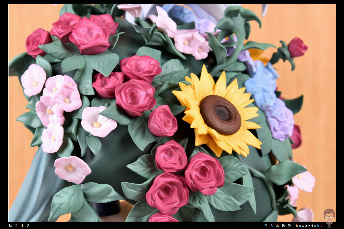
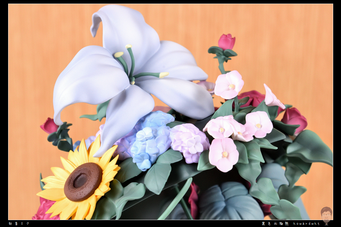
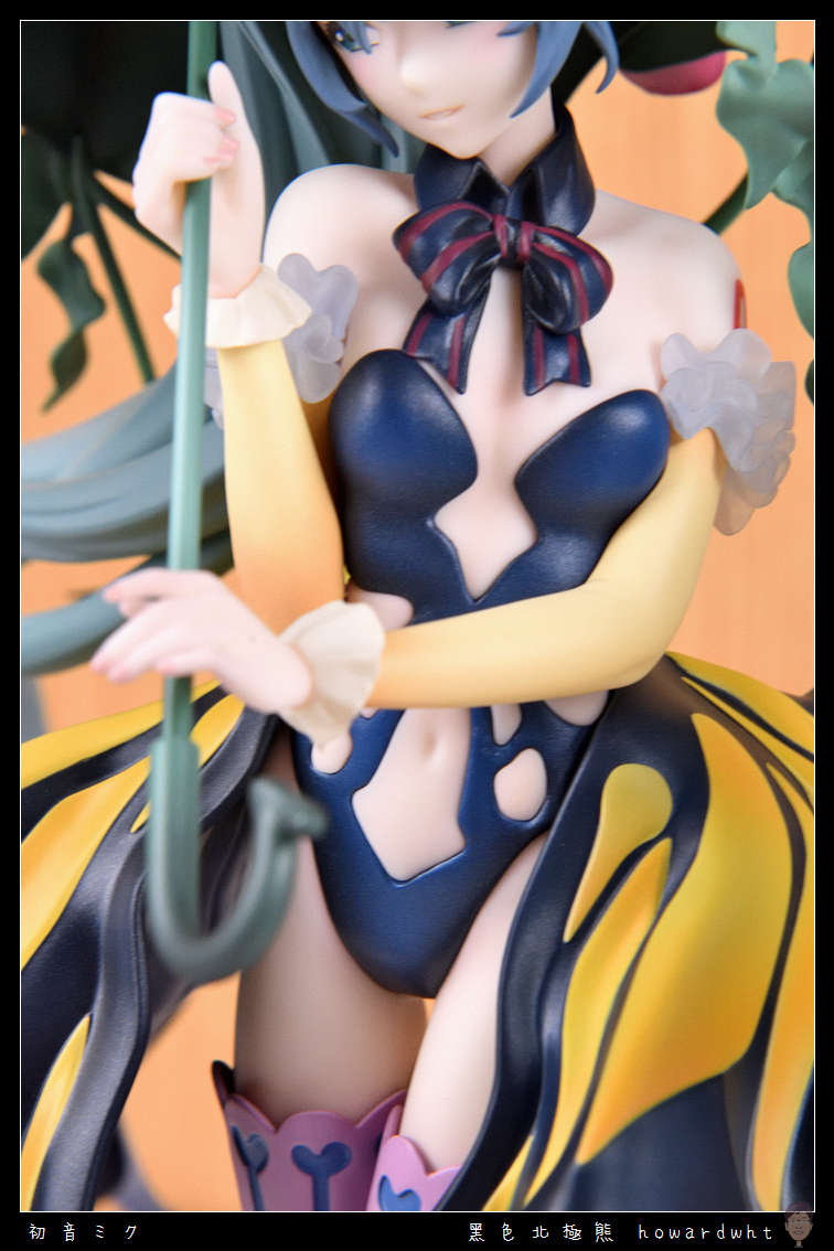
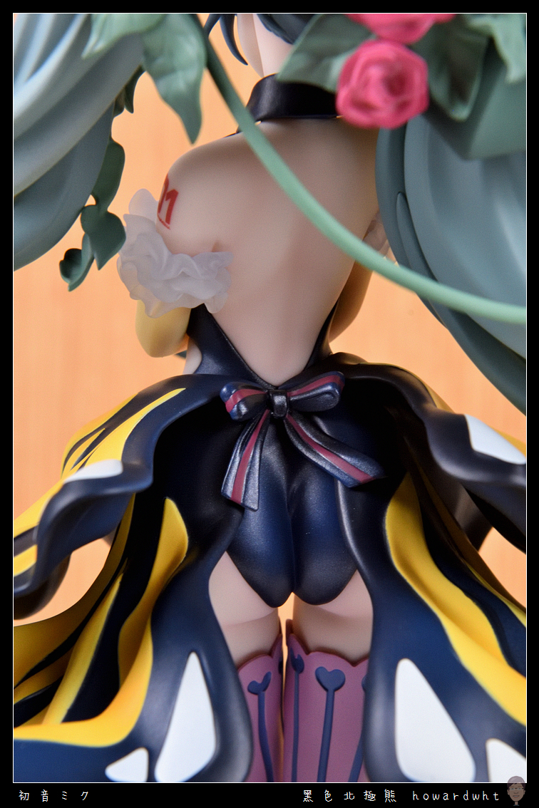
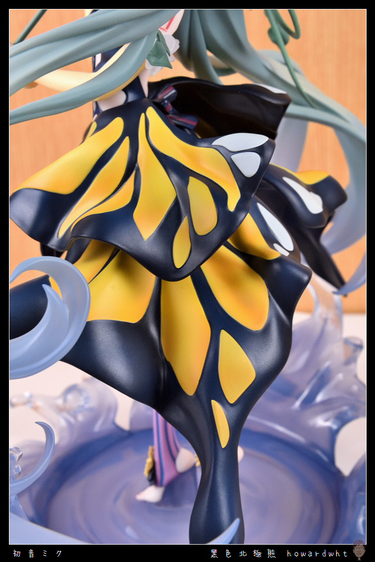
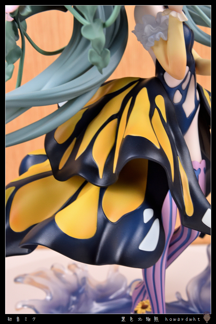
However, I must state the unpleasant truth upfront in this unboxing: while the main figure's sculpt is indeed excellent, the paint application leaves me speechless, and the level of refinement needs significant improvement.
For a price tag of over 6,000, nearly 7,000 [currency units], the paint quality is roughly on par with an Ichiban Kuji prize, and potentially even worse than some well-executed Ichiban Kuji figures.
It's truly a shame for such a unique and beautiful design.
Before pre-ordering, I wasn't very familiar with this manufacturer, only knowing they were a Chinese company.
Now, I know I will be cautious with this manufacturer in the future.
I've never been afraid to let everyone know when I've purchased something subpar in my unboxings; consider this a public service to help others avoid potential pitfalls.
FB Page - Black Polar Bear's Otaku Life (Main Interaction Page)
Bahamut Home (Various Complete & Simple Unboxings)
Instagram (Selected Photos, good for quick glances)
X (formerly Twitter) (Selected Photos + Uncensored Content)
Flickr (Complete Albums, Censored Content)
Photos below
The front of the outer box design is acceptable.
However, I find the back to be full of irony; is it an admission of how they managed to ruin a good prototype with the paint application?
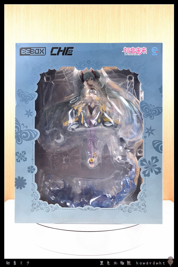
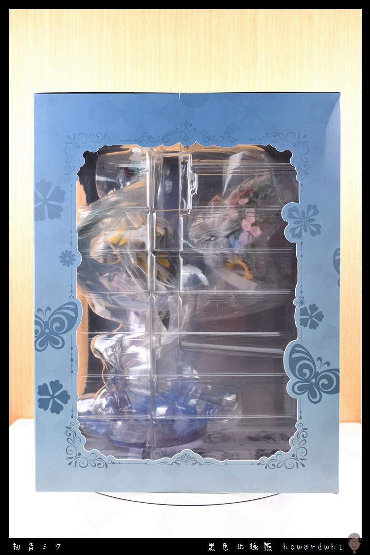
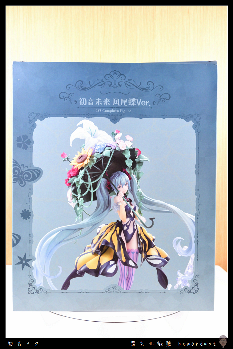
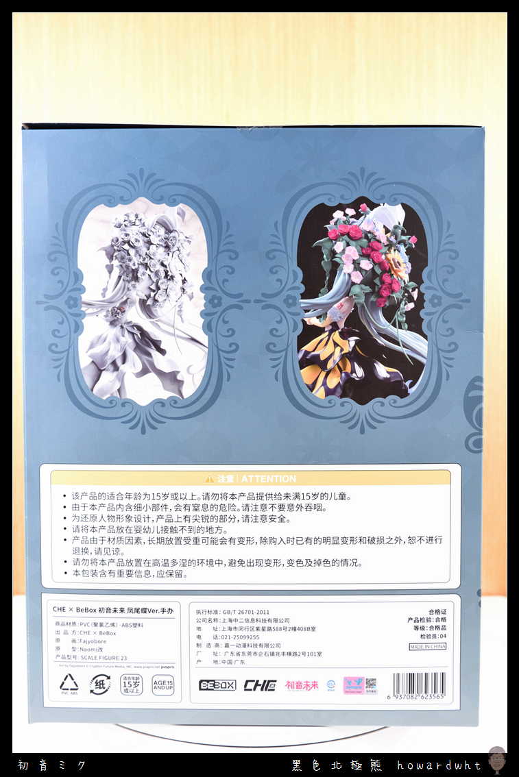
Contents
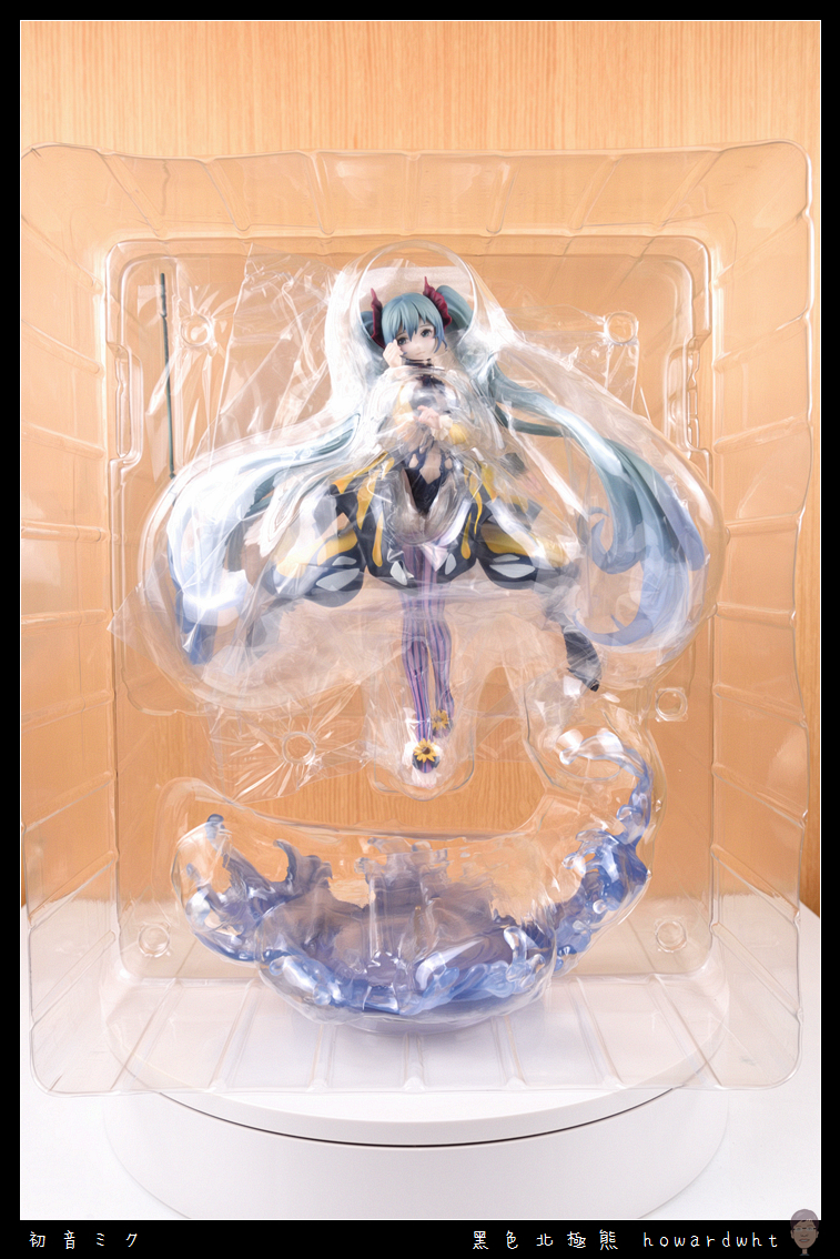
Figure Overview
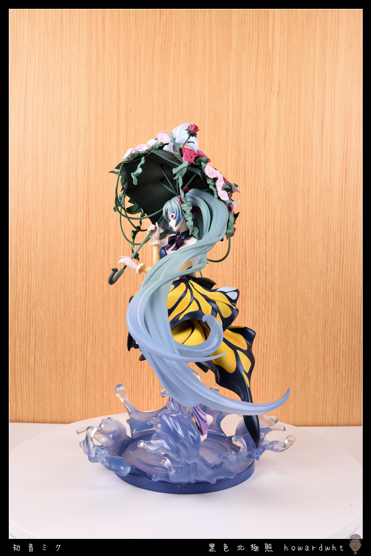
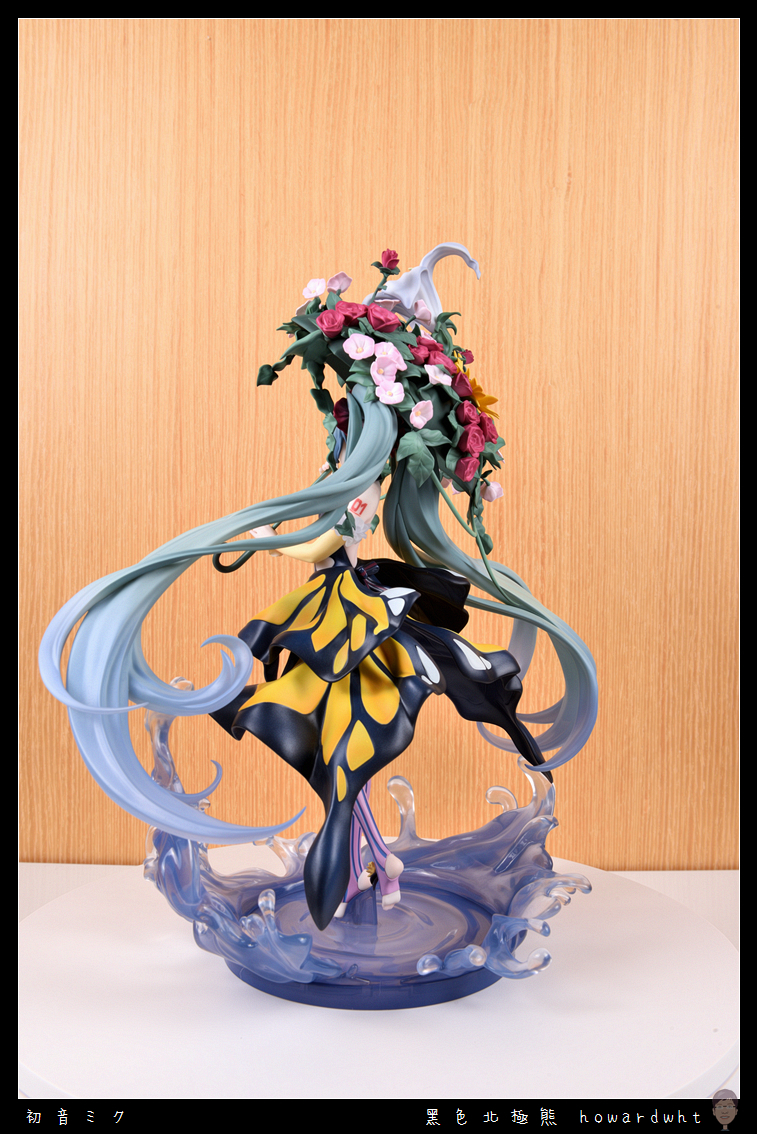
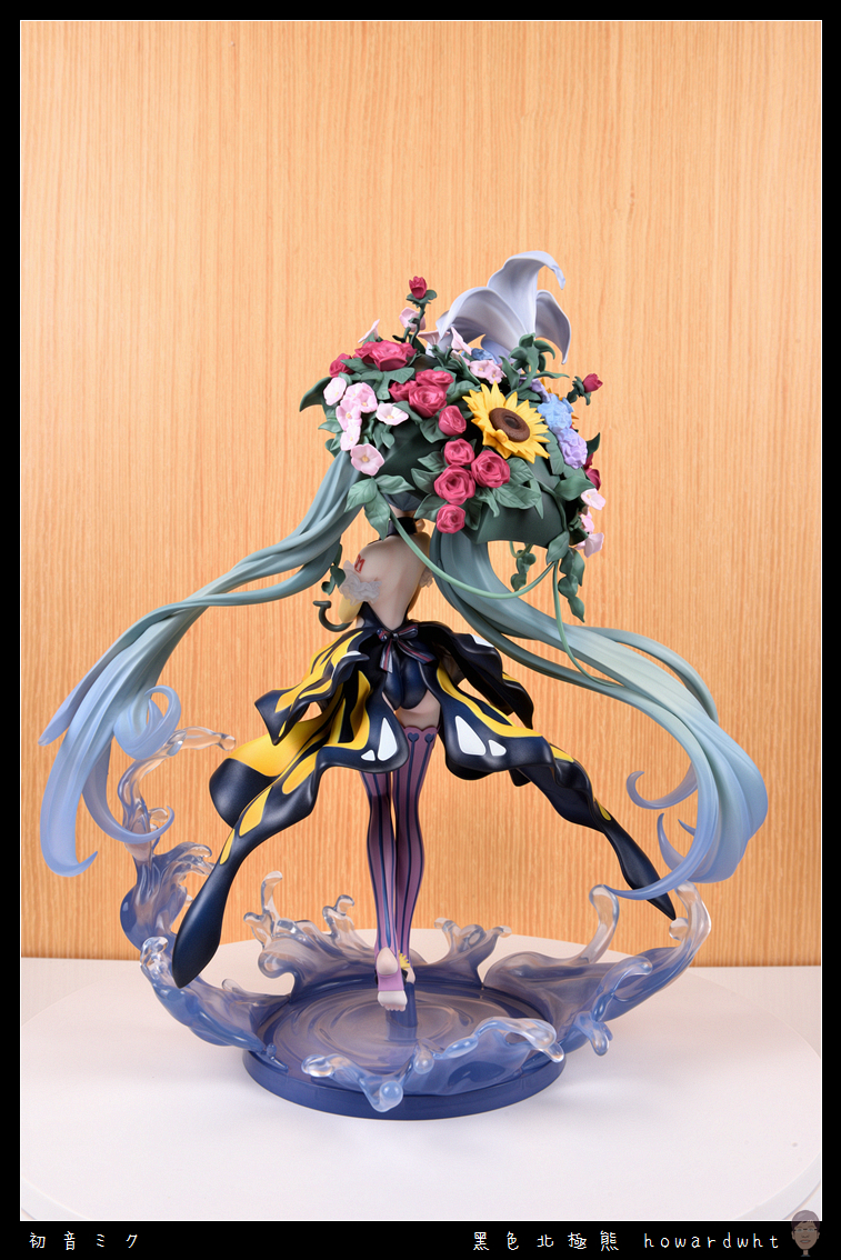
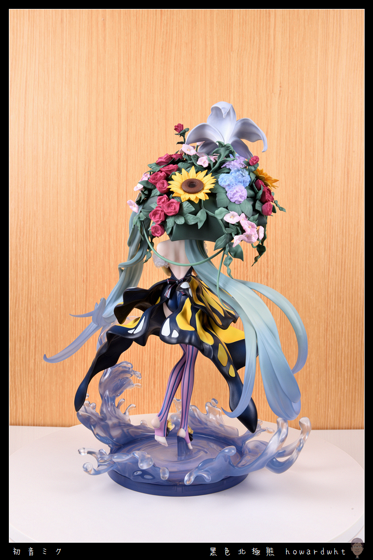
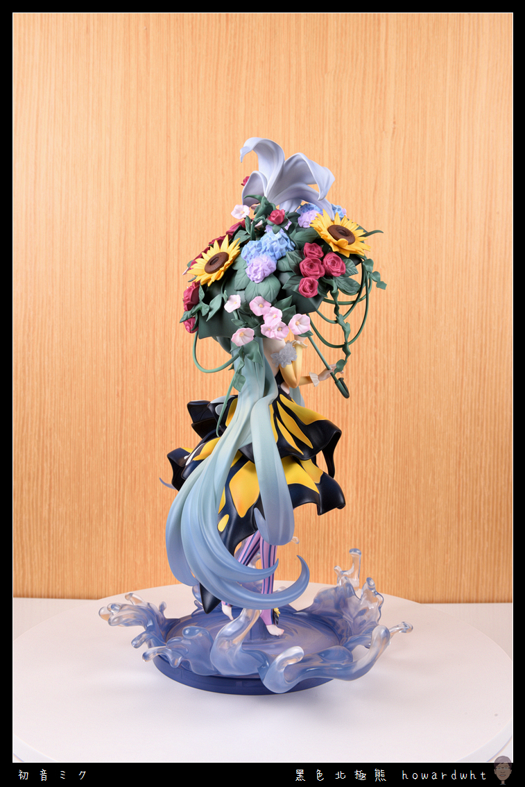
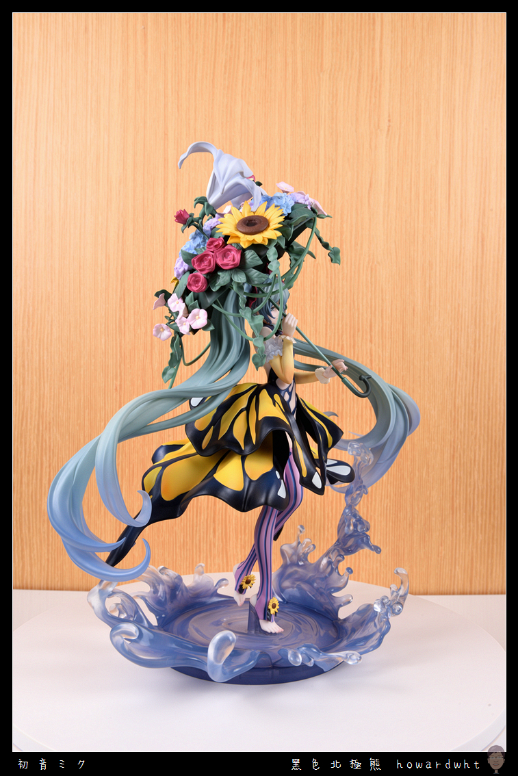
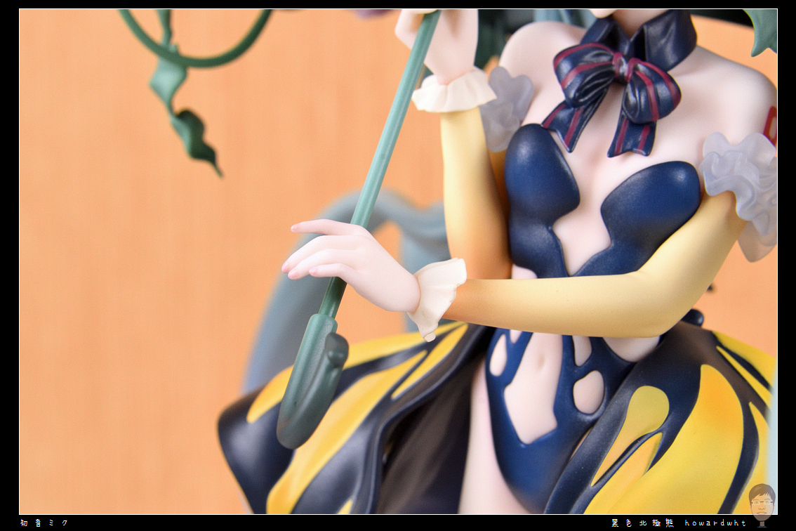
The paint application in many areas is very monotonous, lacking any sense of gradient, much like using the "fill color" tool in MS Paint.
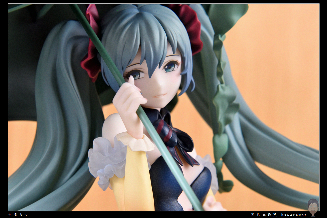
The most visually prominent part, the umbrella, is a prime example; the green areas are all a single shade of green, without any depth or shading, resulting in an unnatural and unrefined appearance.
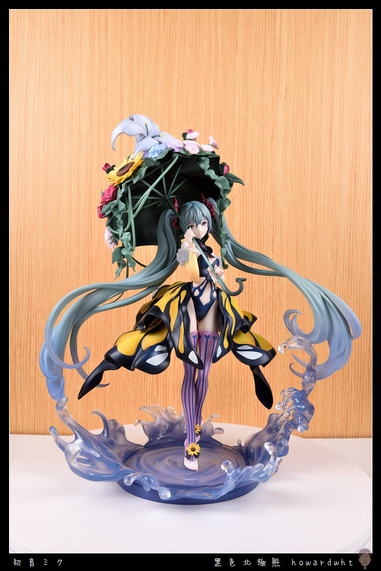
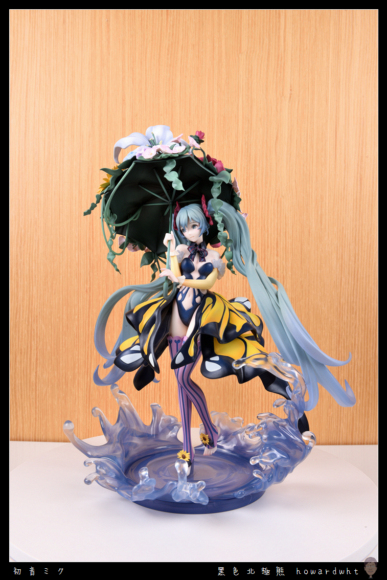
To be fair,
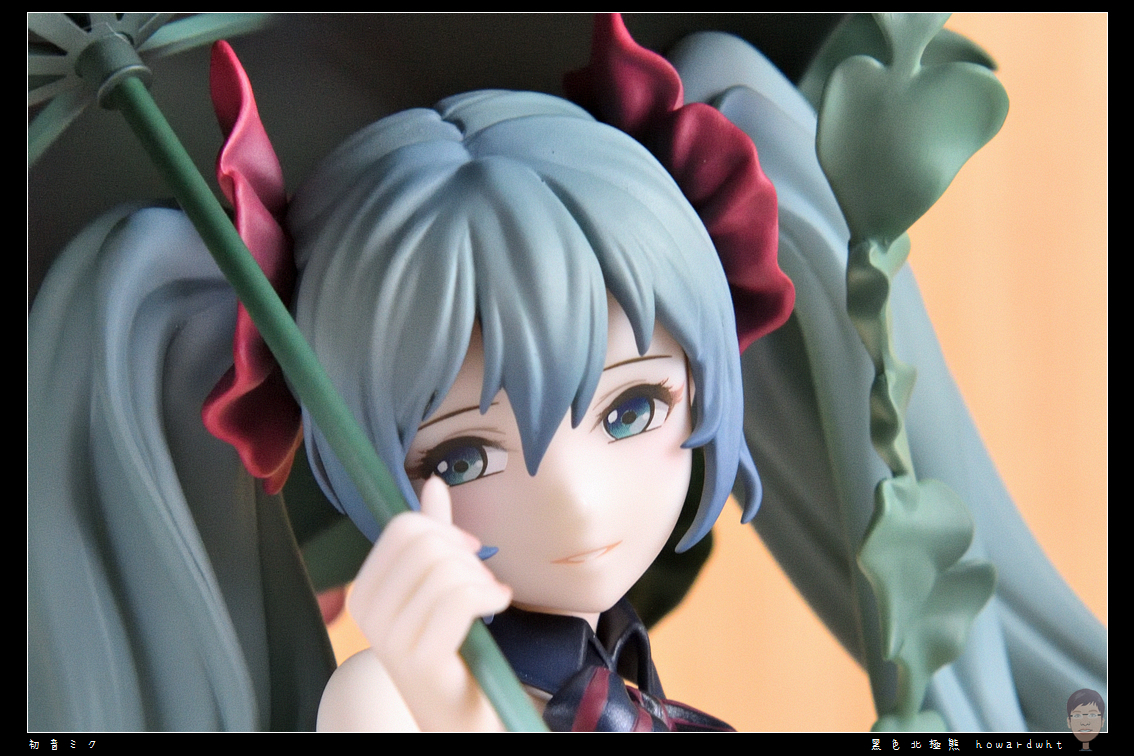
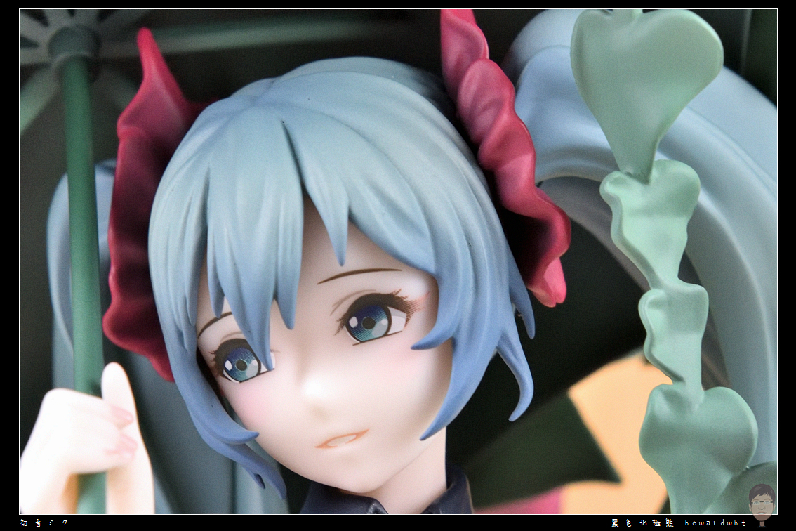
Before unboxing, I saw some simple unboxings from China where the facial photos looked quite ugly, which initially stunned me.
However, upon my actual inspection, I find the face acceptable, though the hair sculpt could be more refined.
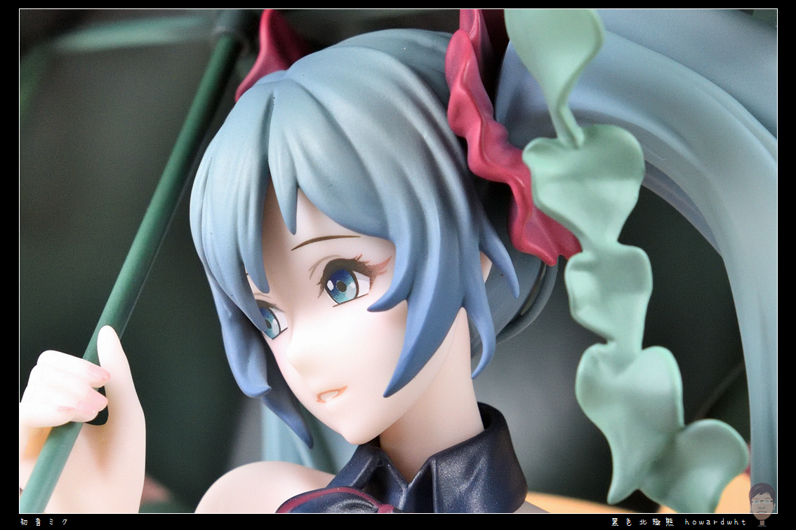
Twin Tails
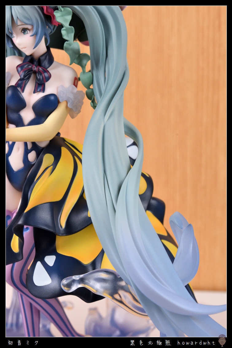
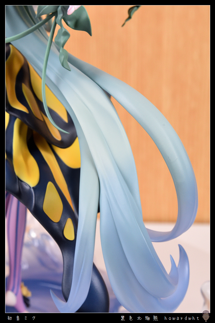
Umbrella
The excessive use of a single shade of green, which was originally intended to be the most distinctive highlight, has unfortunately become a major flaw.
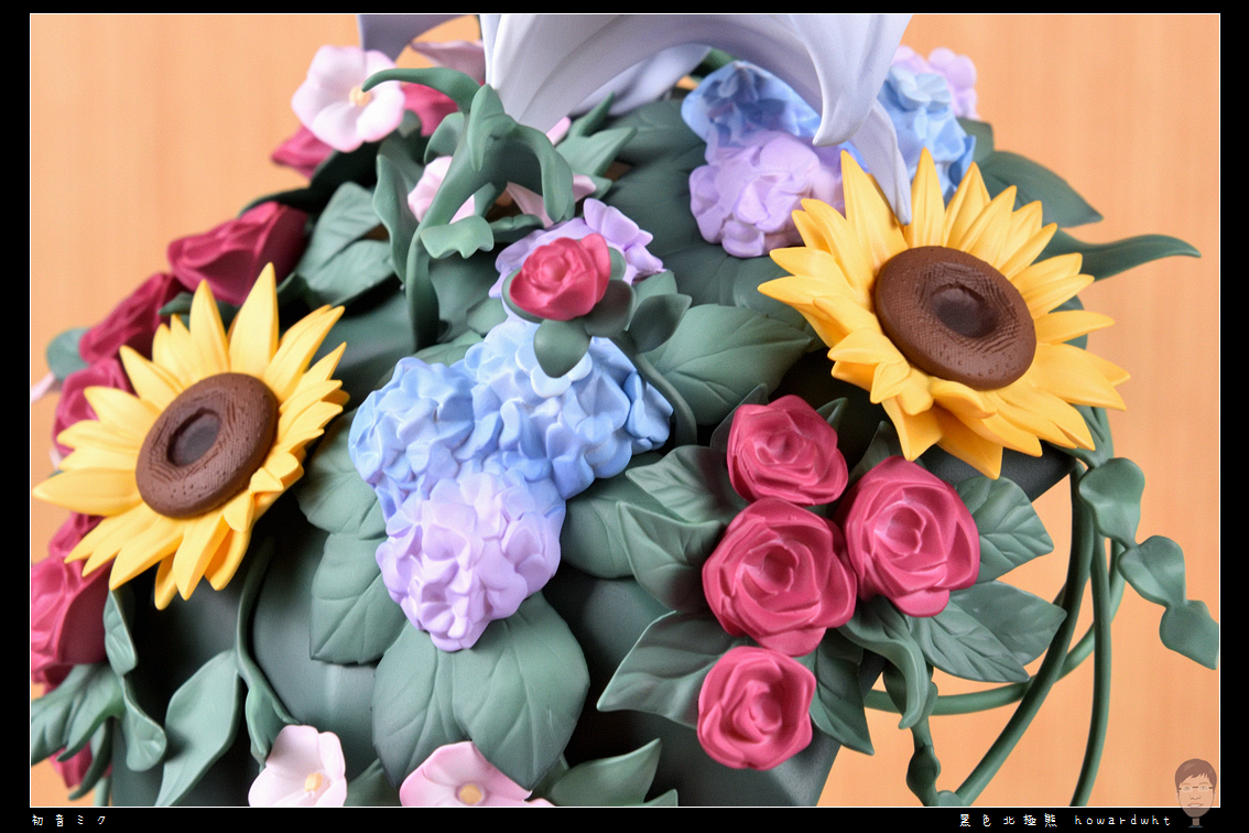
Hand Sculpting
Clothing
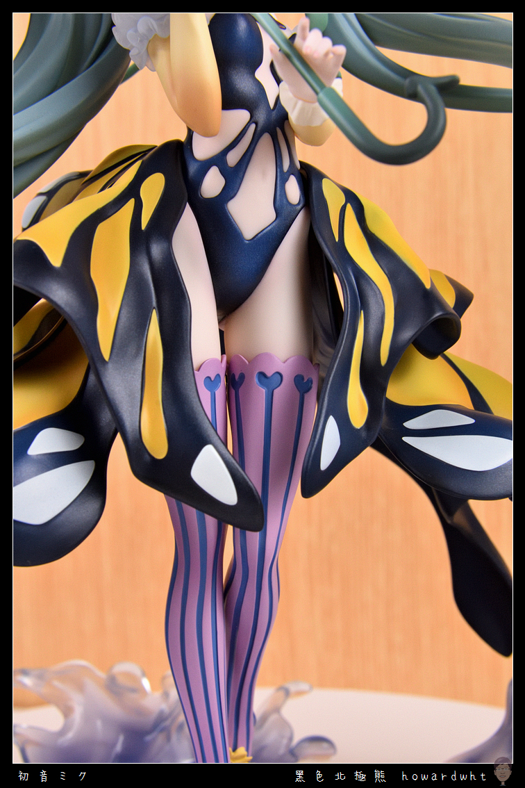
Feet
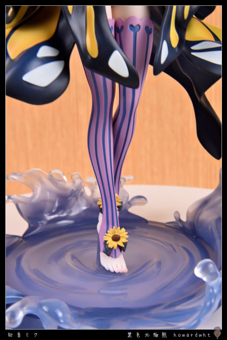
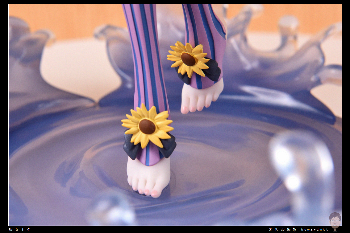
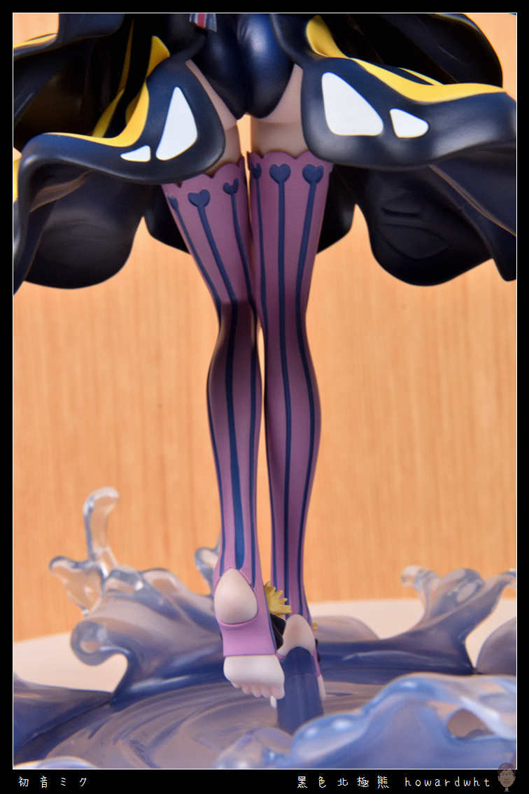
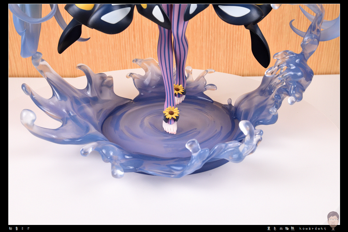
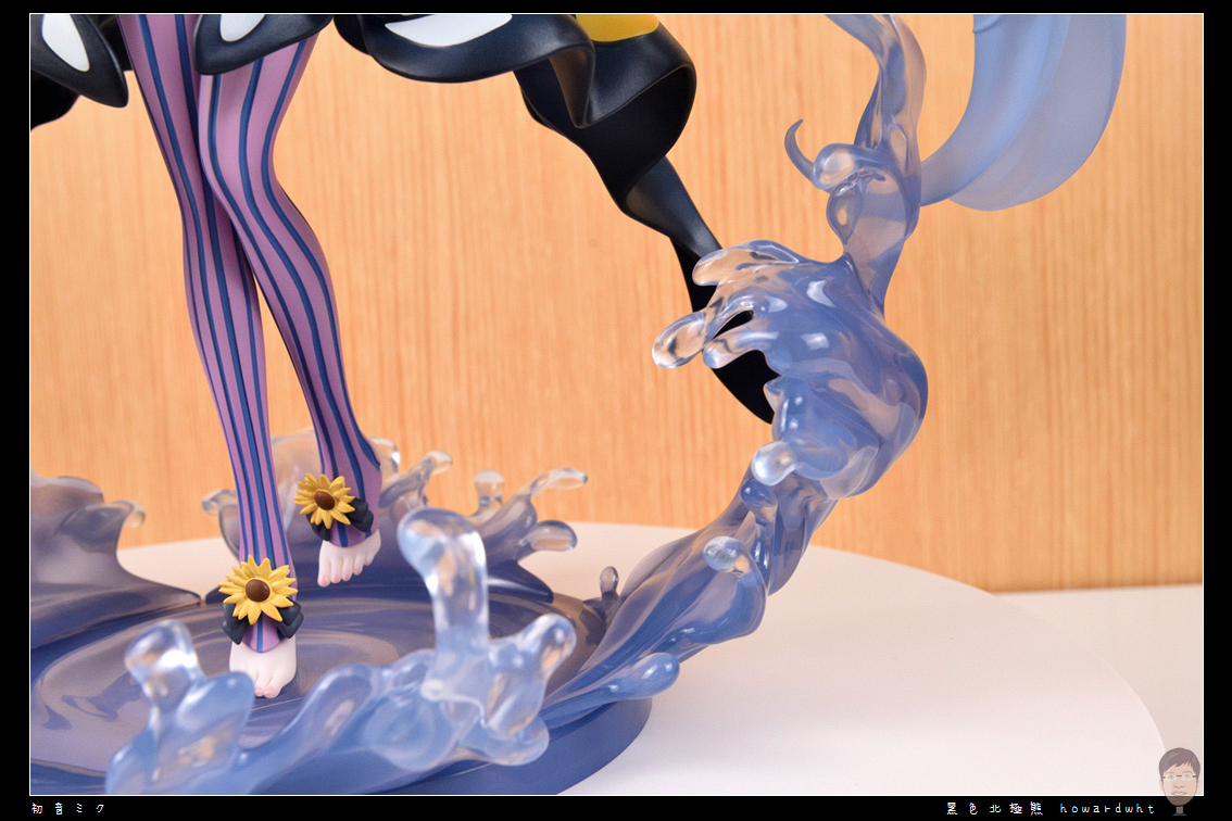
The entire foot area, surprisingly, is quite well-executed.
Base
It attempts to depict splashing water, but the blue color appears blurry and indistinct.
That largely covers the contents.
Personally, I absolutely cannot recommend adding this figure to your collection; it's best to just admire it from afar.
Unless someone is clearing it out at a significant discount, then perhaps you could consider it as a bargain.